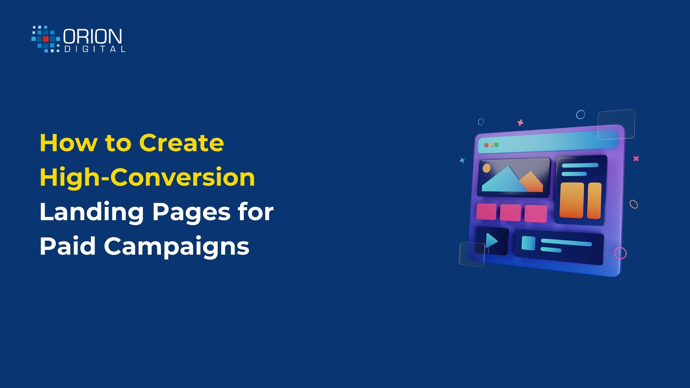
How to Create High-Conversion Landing Pages for Paid Campaigns
- Chitra Rajput
- February 4, 2026
- Digital Marketing
- 0 Comments
It’s easy to run paid advertisements. Getting results from them is not. After spending a lot of money on Google or Meta advertisements to increase website traffic, many companies question why leads don’t convert. The landing page is typically the issue rather than the advertisement.
A landing page with a good conversion rate doesn’t seem fancy. It appears concentrated. It eliminates uncertainty, communicates clearly and directs the visitor to perform a single, obvious action. Here’s how to create landing pages that drive traffic from sponsored campaigns.
Start with One Clear Goal
Attempting to do too much on one page is the most common mistake made by companies. Filling out a form, scheduling a call, downloading a guide or making a purchase should be the only objectives of a landing page.
Eliminate distractions. No more than one CTA. There are no pointless menu links. When someone clicks on your advertisement, they should immediately understand what you want them to do.
Every time, clarity triumphs over creativity.
Match the Message from the Ad
The landing page must look like a natural continuation of the advertisement. The landing page should reiterate your advertisement’s “Free Consultation for Business Owners” message rather than immediately listing all of your offerings.
Visitors become confused and leave when the message on the landing page and the advertisement don’t match. Maintaining consistency keeps them interested and develops trust.
Write Headlines That Speak to Problems
Brand stories are not the reason people visit landing pages. They come in search of answers.
One basic question should be addressed in your headline: “What’s in it for me?”
Stay clear of misleading phrases like “We Are Industry Leaders.” Instead, concentrate on concrete outcomes, such as time savings, cost savings or problem solving. Keep your language simple and clear.
Keep the Design Clean and Focused
The eye is naturally guided by a well-designed landing page. More important than eye-catching images are white space, distinct sections and understandable fonts.
You shouldn’t have to scroll to see crucial components like the title, advantages and call to action. Don’t use images to adorn the site; instead, use them to support the message.
Mobile optimization cannot be compromised. Nowadays, mobile devices account for the majority of paid traffic.
Highlight Benefits, Not Just Features
Results are more important to visitors than features. Describe the benefits of your product or service rather than just listing its features.
For example:
– Not “Advanced Analytics Dashboard”
– But “Track your leads and ROI in real time”
This shift in language makes a big difference in conversions.
Build Trust with Proof
Before disclosing personal information or funds, people exercise caution. This reluctance should be lessened by your landing page.
Add trust signals like:
– Client testimonials
– Reviews or ratings
– Media mentions
– Certifications or awards
Even small proof points help reassure visitors that they’re making the right choice.
Make Forms Simple and Friendly
Conversions are killed by long forms. Just ask for what you truly need. Usually, a name, phone number and email are sufficient.
Inform users of the next steps as well. Are they going to get a call? Will an email be sent to them? Having clear expectations boosts form submissions and lowers anxiety.
Strong CTA Without Pressure
Instead of being confrontational, your call to action should be welcoming. Pushy sales language is less effective than phrases like “Get Started,” “Book a Free Call,” or “Request a Demo.”
Strategically position CTAs after important sections and above the fold.
Test, Improve, Repeat
No landing page is perfect on day one. High-conversion pages are built through testing.
Experiment with:
– Headlines
– CTA text
– Form length
– Page layout
Small changes often lead to big improvements.
Conclusion
A landing page with a good conversion rate doesn’t shout. It directs. It respects the visitor’s time and provides concise answers to their questions.
Don’t raise the budget first if your paid efforts aren’t working. Make the landing page better. The true opportunity is often found there.
Related Posts

